lnk.bio Alternative: When Buttons Aren't Enough
A bio page that's just buttons is a missed opportunity
lnk.bio does the minimum. You get links, you get buttons, you get a page that technically works. What you don't get is a page that feels like you — something with a header that sets the tone, photos that show what you do, descriptions that give context to each link. Just buttons. That's the deal.
Most people don't notice what's missing until they see a page that has it. Then it's obvious. The difference between a list of links and a page that has a gallery, a short bio, service descriptions, and a FAQ is the difference between a business card and a proper introduction. One tells you a name and a number. The other tells you who you're dealing with.
What's actually missing from lnk.bio
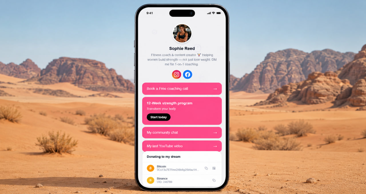
No gallery. You can't show photos of your work, your space, your products, your before-and-afters. You get a link to your Instagram — and hope the visitor follows it. That's a step removed from the person who just clicked your bio link and was ready to see more. A gallery on the page itself removes that friction entirely.
No descriptions. Every link is just a label. "My shop." "Book here." "YouTube." There's no context, no reason to click, no sense of what the visitor is getting before they tap. A link with a description — "60-minute deep tissue massage, starting from $80, book online" — converts differently than a button that says "Booking." The words do work. lnk.bio gives you the button without the words.
No personality above the fold. Twitter-style headers, cover photos, the kind of visual framing that tells someone who you are before they read a single word — none of that. You get a profile photo, a name, and buttons. That's the template. Everybody gets the same template.
Create your link-in-bio page free
No credit card. Gallery, descriptions, FAQ, services — all included. Ready in 2 minutes.
Get started free →What a page looks like when someone actually thought about it
A cover image that sets the visual tone before anything else loads. A gallery that shows your work to people who've never seen your Instagram. Service descriptions with context and pricing. A FAQ that answers the questions your visitors always have. Links that feel like offers rather than placeholders.
That's what ClickInk gives you on the free plan. Not as upgrades — as defaults. The reasoning is simple: a page that represents you properly is better for you and better for the people visiting it. A visitor who finds what they came for on the first page they land on is a visitor who doesn't leave to go looking elsewhere. When you feel respected by a product — when it gives you real tools instead of the bare minimum — you use it differently. That's the page worth building.
ClickInk vs lnk.bio — what you actually get
Gallery, cover image, services, FAQ, crypto block, 35 languages, no ads, no watermarks. All free. Not just buttons.
Try ClickInk free →35 languages. No ads. No platform logo on your page.
lnk.bio is built primarily for English-speaking markets. If your audience is in Brazil, Mexico, Japan, or anywhere the default language isn't English — the tool works against you before a visitor reads a single word. ClickInk supports 35 languages out of the box. Your page speaks the right language for your audience without extra configuration.
No ads on any user page. No ClickInk branding visible to your visitors. No link limits. Free plan that's an actual free plan — not a trial, not a stripped preview. Build the page you'd be comfortable sharing with anyone who finds you. Switch from lnk.bio in under 10 minutes. Nothing is lost except the limitation.
Your page at click.ink/yourname
Free to start. No credit card. Switch from lnk.bio in under 10 minutes.
Switch to ClickInk →