How to Get More Clicks on Your Bio Link (What Actually Works)
More followers don't automatically mean more clicks. The page does.
A creator with 50,000 followers and a poorly structured bio page gets fewer clicks than one with 10,000 followers and a page that's built to convert. The follower count gets people to the link. What happens after the click depends entirely on what they find. Most creators optimize their content obsessively and leave their bio page as an afterthought. That's where the clicks are being lost.
The good news: the fixes are simple. Not a redesign, not a strategy overhaul. Specific changes to button order, offer framing, and page design that move the numbers in a direction that's immediately measurable.
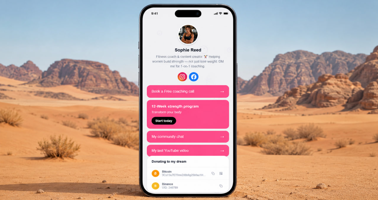
Button order is the single most important variable
Every visitor to your bio page sees the top. Not everyone scrolls. The most important link goes first — full stop. Not the link you added most recently, not the one you think is interesting, not the one buried under three others. The one that matters most to your business or your audience right now.
Think about what action you most want a visitor to take. Buy something. Book a session. Subscribe to a newsletter. Follow on a specific platform. That action goes at the top. The second most important action goes second. Everything else follows in descending order of importance. This isn't design advice — it's mechanics. The top of the page gets the attention. Put what matters there.
Revisit this order regularly. What mattered most three months ago might not be the priority today. A page where the top button still leads to a sold-out product or an expired offer is actively losing clicks. Keep it current.
Build a page that actually converts — free
No credit card. No link limits. Gallery, products, services, FAQ — everything in one place.
Get started free →The offer on the button matters as much as the button itself
"Link in bio" gets fewer clicks than a specific offer. "My new collection is live" gets more clicks than "Shop." "Book your free consult" gets more clicks than "Contact me." The framing on the button — and in the caption that sent someone to the bio in the first place — determines whether they click or keep scrolling.
Write button labels that tell the visitor exactly what they're getting and why it matters now. Specificity outperforms generic labels every time. "Download the free meal plan" beats "Free resources." "Watch the full tutorial" beats "YouTube." "Get 20% off this week only" beats "Shop." Test different labels on your most important button and watch what happens to the click rate. The difference is usually larger than expected.
ClickInk — full control over button order, labels, and page design
Arrange links by priority, customize every button, add a gallery that keeps visitors on the page longer. Free to start.
Try free →A photo and a description keep people on the page longer
A page that's just a list of buttons gets scanned and closed. A page with a profile photo, a clear one-line description of who you are and what you do, and a visual element — a gallery, a featured product image — keeps people on the page long enough to make a decision. Time on page correlates directly with click rate. Give people a reason to stay for ten seconds instead of three.
The description matters more than most creators think. "Fitness coach helping busy parents build strength at home" tells a visitor immediately whether they're in the right place. "Welcome to my page" tells them nothing. Use the description to qualify your audience — the right people will feel seen, the wrong people will leave, and that's exactly right. Clicks from the wrong audience don't convert. Clicks from the right audience do.
Design affects clicks — even if visitors can't say why
A page with a considered background, clean typography, and a layout that doesn't look like the default template has better click rates than one that looks like every other page on the platform. Visitors can't always articulate why they trust one page more than another — but the visual signals are real and they add up. A page that looks like it was built intentionally communicates that the person behind it is credible. That credibility transfers to the links on the page.
ClickInk gives you parallax backgrounds, animated patterns, custom fonts, and a gallery block that keeps visitors engaged longer than a plain link list. No ads between your buttons, no platform branding competing for attention. The page you build is the page your visitors see — nothing added, nothing subtracted. Free plan included. Build the page that actually does what you need it to do.
Your page at click.ink/yourname
Free to start. No credit card. More clicks start with a better page.
Build your page →